The paradigm of building software using AI (via e.g. Cursor or v0) and standardized design systems (like shadcn) has streamlined the product development process, making it easier than ever to create applications that look polished and professional.
I love this, but I've noticed it comes at (least for now) a cost. When every app is built on the same foundations and models, the result is a smörgåsbord of experiences that lack personality, originality, and distinguishability.
So let’s dive in to how products with millions of users create their edge, and outline some best practices and high-level principles to make your designs stand out.
Reinvent and reuse
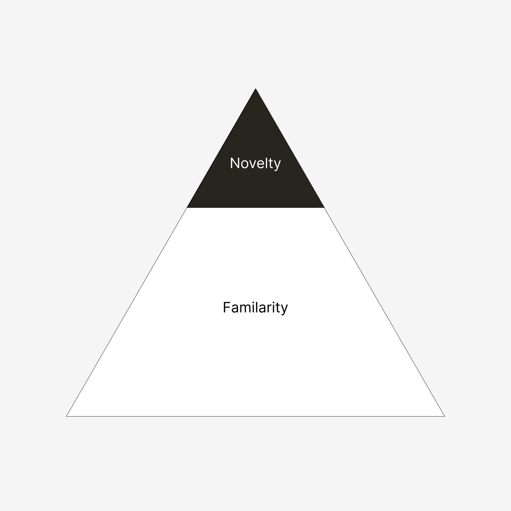
The best products strike a balance between familiarity and novelty, offering users a sense of both home and innovation at the same time. New and old reliable, hand in hand.
Ideally, your app's new features and interaction patterns should blend harmoniously with familiar components that users instantly recognize from other products they love and use daily.
Most interactions and flows in your product should be generic, established, and feel familiar. This way you leave cognitive and visual space for the novel flagship features you want to highlight.
So to be clear, public design systems are great and prevent product teams from reinventing the wheel. But a risk when using these off-the-shelf component libraries is that the user experience can become bland and generic.
Crafting experiences that feel unique and "resonate with your users" is easier said than done and more of a (tbh, kind of vague) end result rather than a process that'll get you there.
So, let's look into how global brands are achieving this à la show, don't tell.
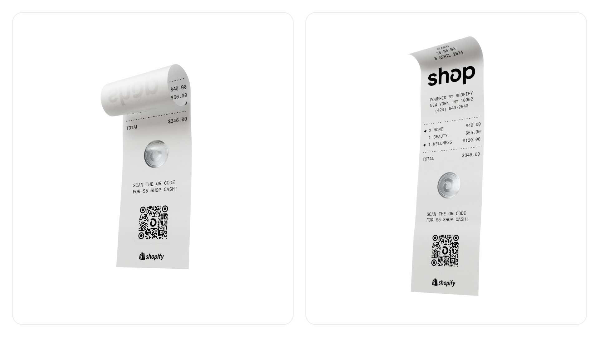
Breathe your brand
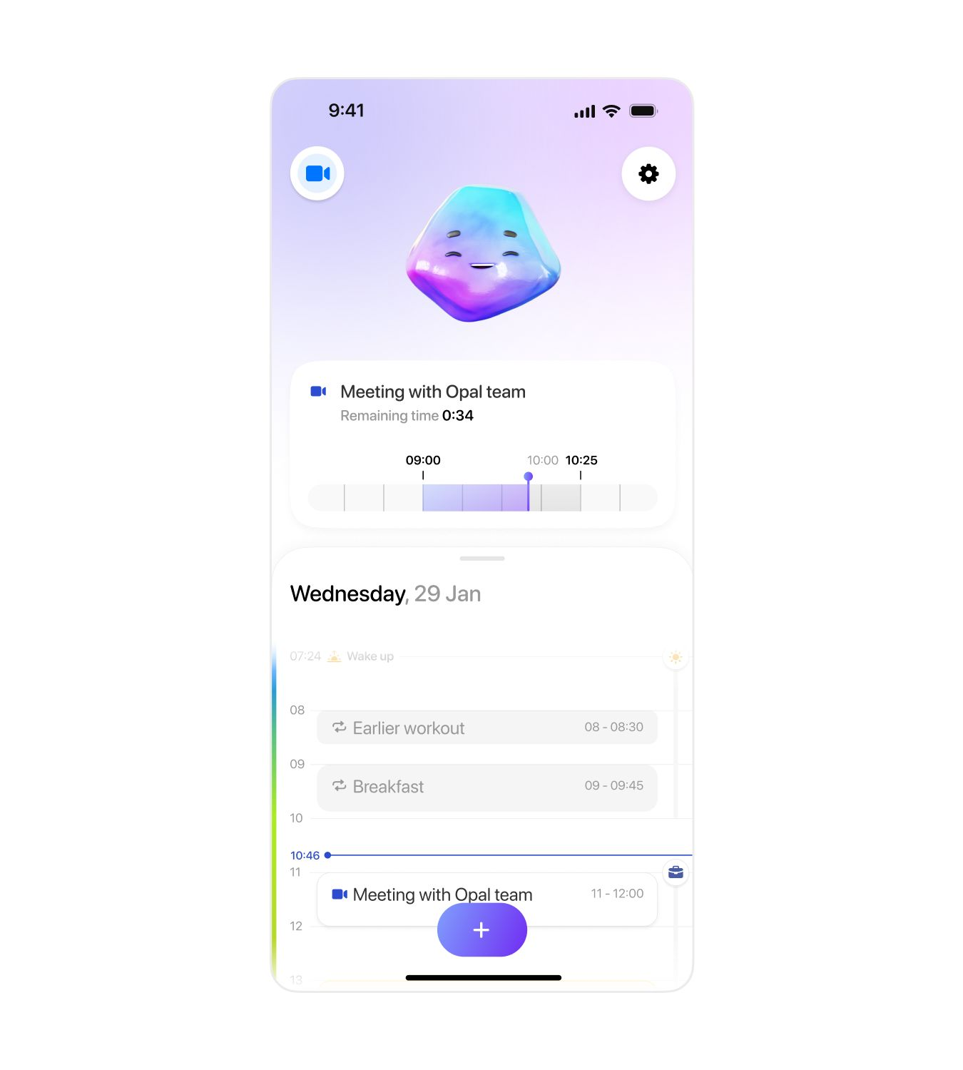
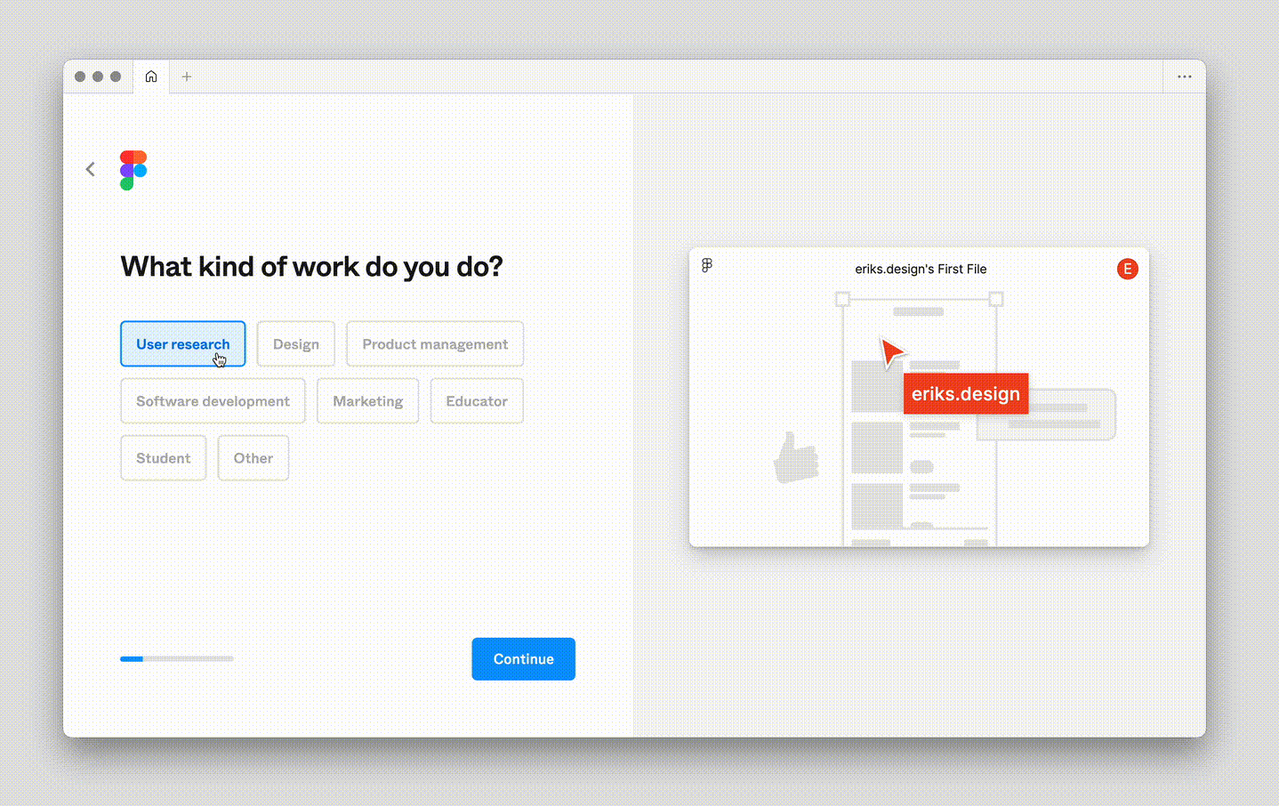
One important key to differentiate your experience is to spark joy between the lines of your UI, and make your app's key flows into brand moments. Make the core interactions feel unique and on brand while keeping the surrounding UI familiar.
To get started, experiment with tailor-made animations, copy, and illustrations designed to frame each part of the experience. Elements that embody entities, steps, or features in your app.
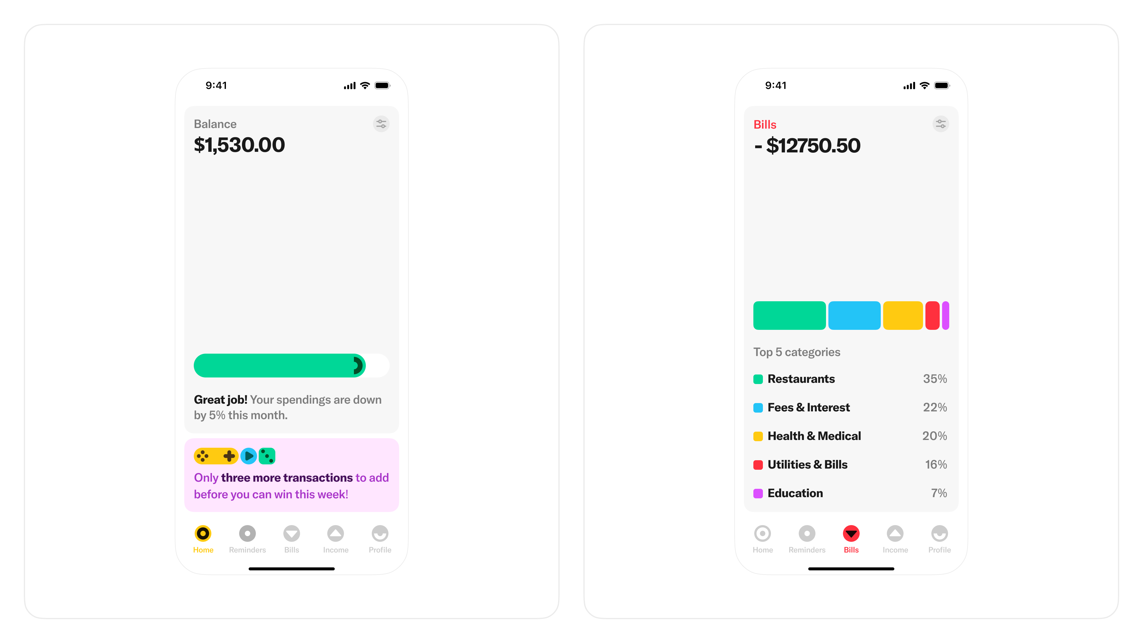
Identify in-between steps of your flows; empty states, loading, success screens, and confirmations, etc., and use these moments to highlight your brand alongside the messaging without slowing the user down.
Consistency is key. Ensure that your brand is introduced seamlessly throughout the flows. Every detail matters. Embedding your brand beyond marketing channels and into the end-user experience is easier said than done, but it's worth it.

Streamline your UI
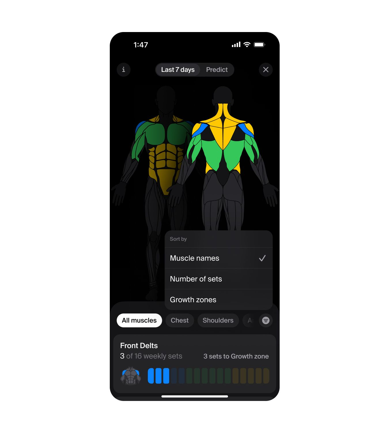
Many apps often present all available features at once, on the top level. Everything is right there, all the time, whether the user needs it or not. This makes sense for some apps, but generally leads to cognitive overload.
The overarching goal should be to make your product accessible to newcomers without sacrificing depth or power for experienced users. This is particularly crucial for flows like onboarding, which can have a huge impact on retention.
Aim to keep only the fundamental features at the user's fingertips, and introduce additional functionalities as they become relevant in the flow. This approach ensures that users are not bombarded with options they don't need.
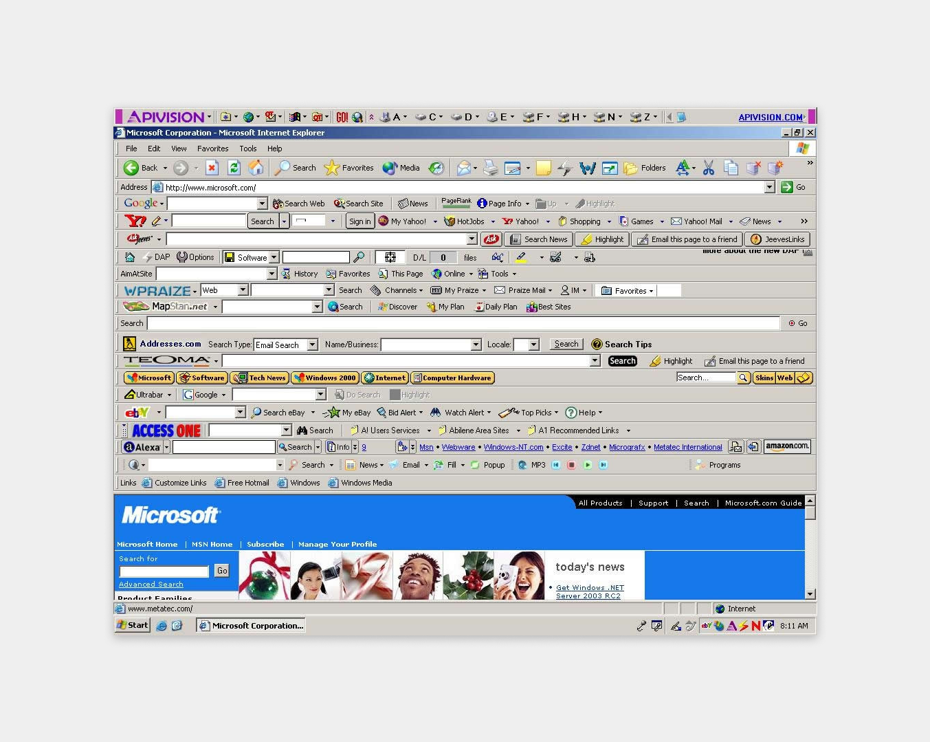
Most product teams are caught up with adding more features, capabilities, and functionality, but very rarely spend time thinking about what can be removed. So every once in a while—instead of adding more—consider simplifying.
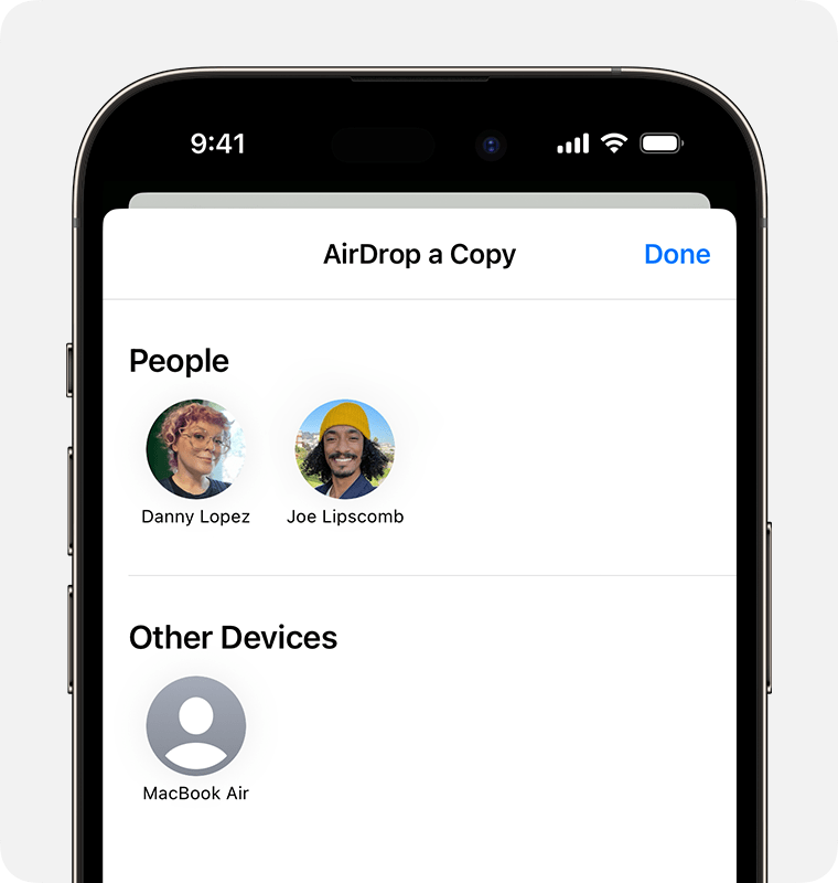
Think of experiences people love, like Apple Pay or AirDrop, which each do one thing exceptionally smoothly without almost any configuration, customizability, or cognitive overload. They just focus on doing one thing well.
Good design emphasizes the usefulness of a product while disregarding anything that could detract (you!!) from it.
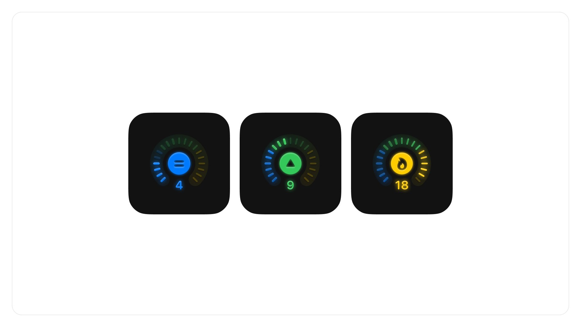
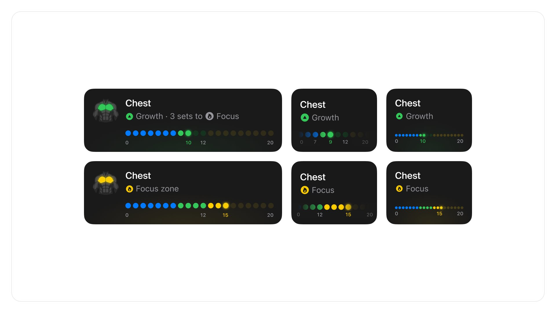
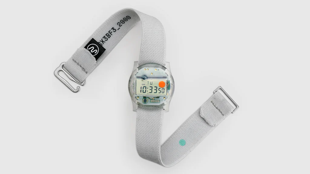
Analog patterns in digital shape
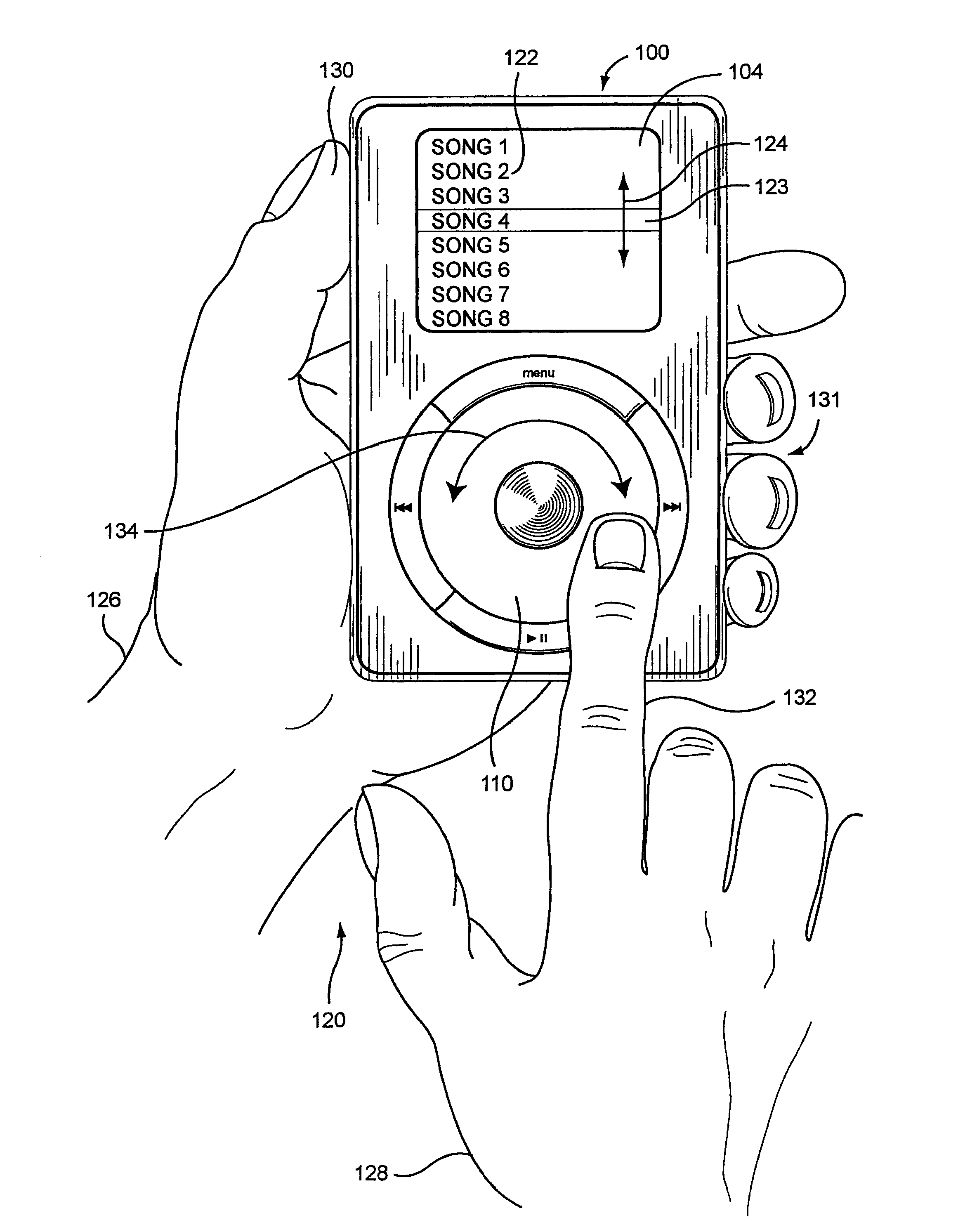
Great interactions are often modeled after properties from the real world. This approach was particularly prominent during the skeuomorphism-era that characterized early versions of iOS, but it remains relevant today.
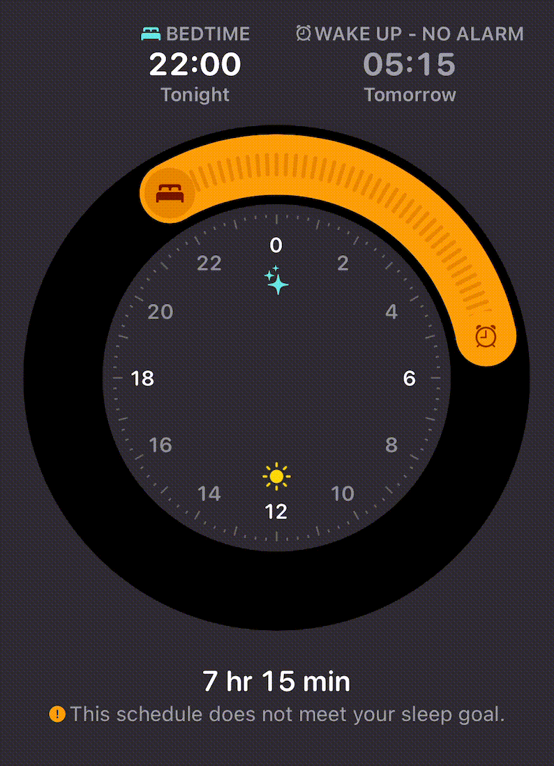
Analog patterns can be used to simplify, overview, and intuitively describe complex interactions. Examples include the use of sliders, toggles, and controls to adjust volume, brightness, or other arbitrary values.
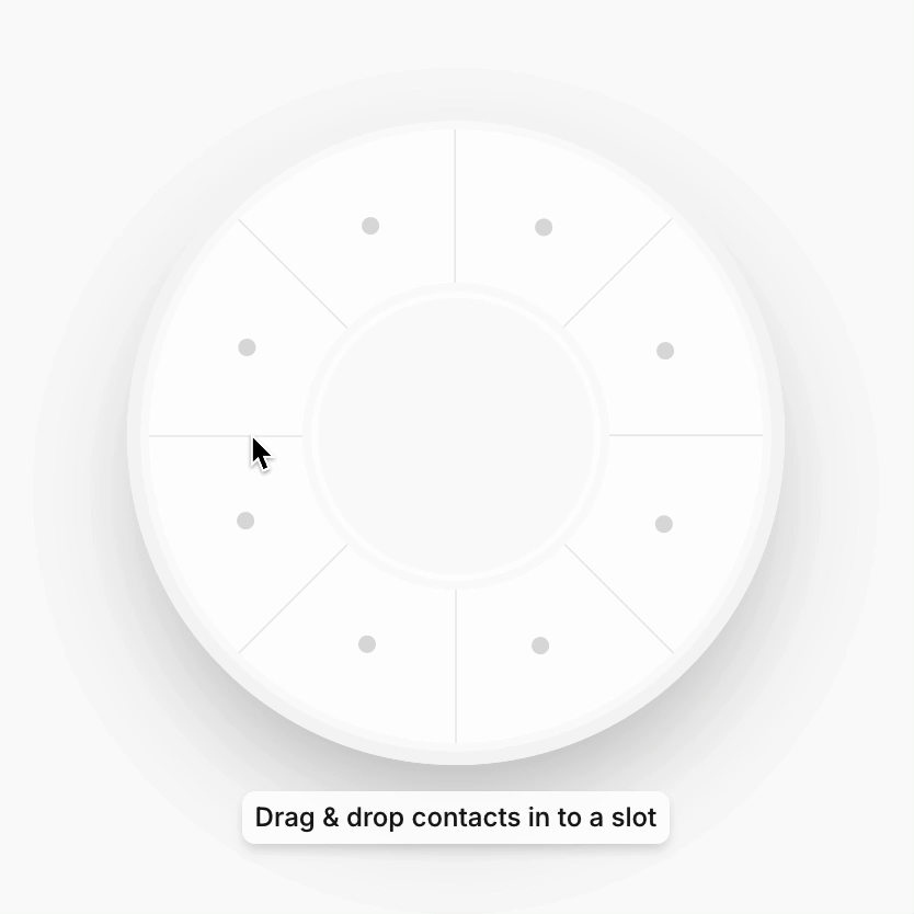
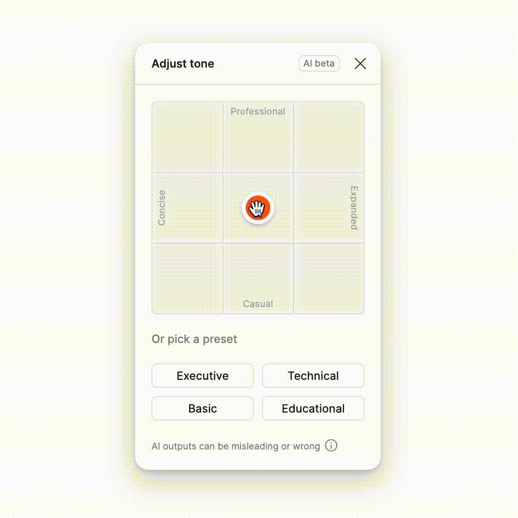
UI parallels to the real world can transform mundane tasks and boring UIs into experiences that spark joy. Give yourself some time here and let your imagination go free. Think of products, patterns, and interactions from the physical world that could inspire your digital experience.
Speech is silver, and action is gold
While education, descriptions, and explicit context can be needed, the real magic happens when users can seamlessly interact with your product without needing instructions. By holding the users' hands less, you empower them to discover and learn on their own.
Instead of relying solely on text to guide users, use visual cues and interactive elements to lead them through the experience.
Exceptional software goes beyond function; it creates a connection between people and technology. In a world overfilled with apps, adding polish & joy to the core flows of your product is what transforms users into advocates.
Until next time 👋
Thank you and stay blessed. Included some inspo below, let me know what you think via X.
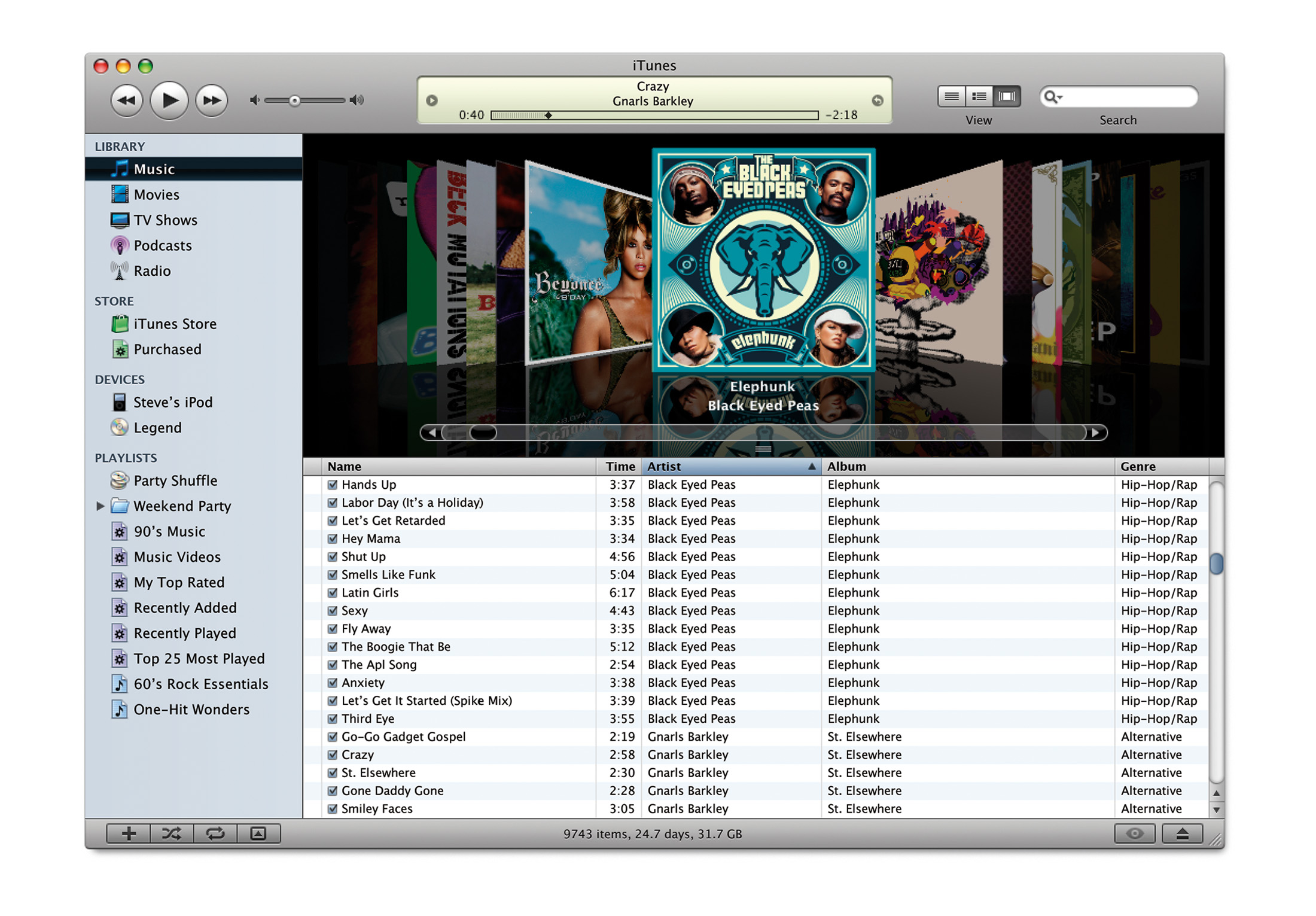
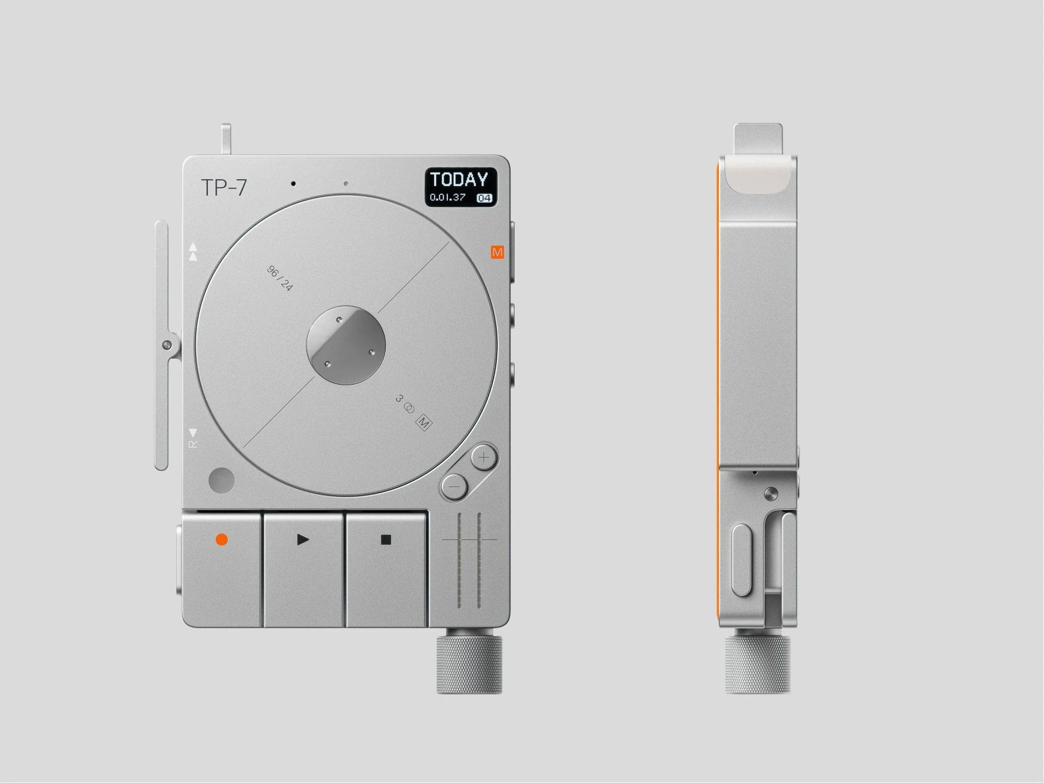
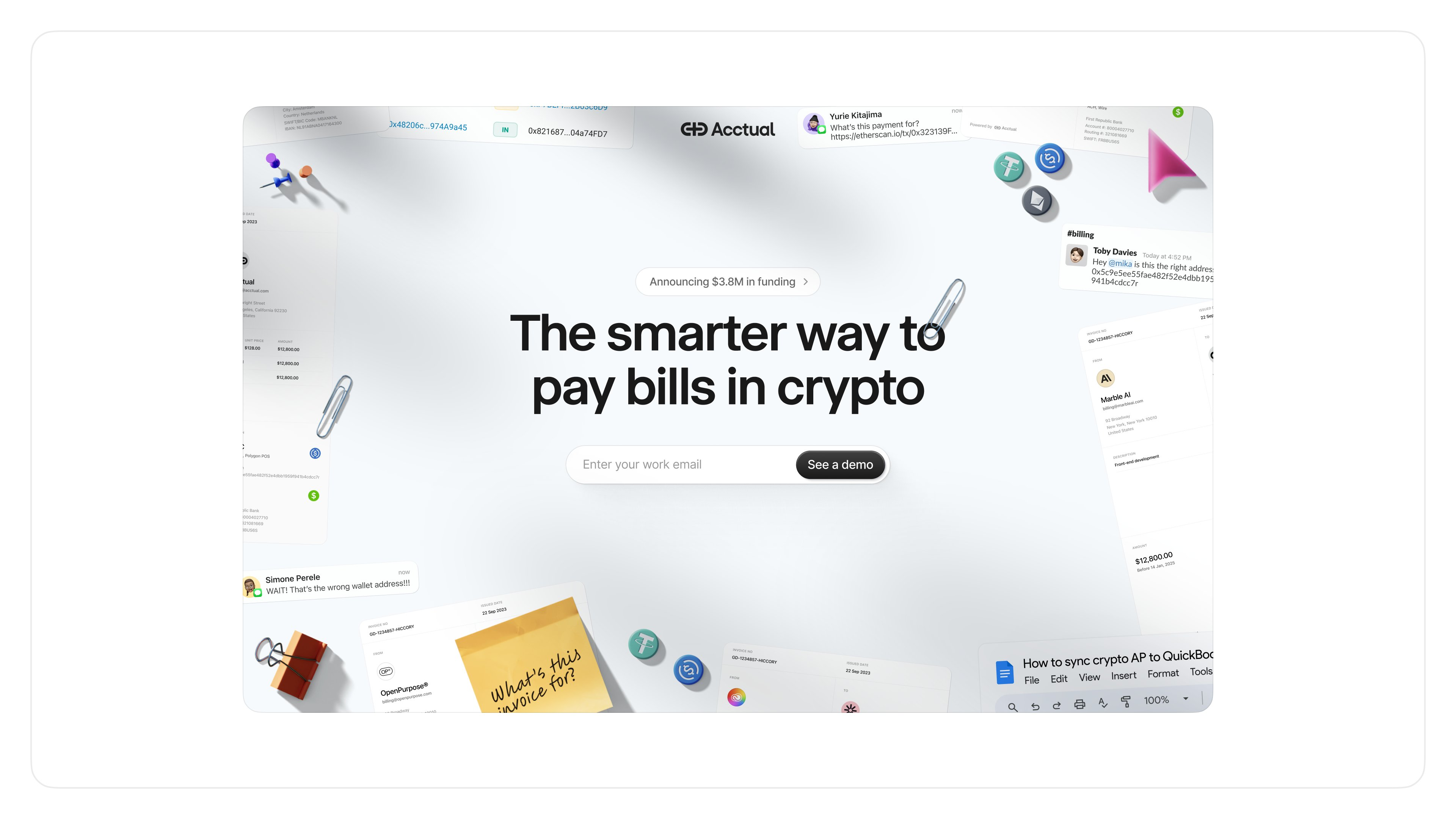
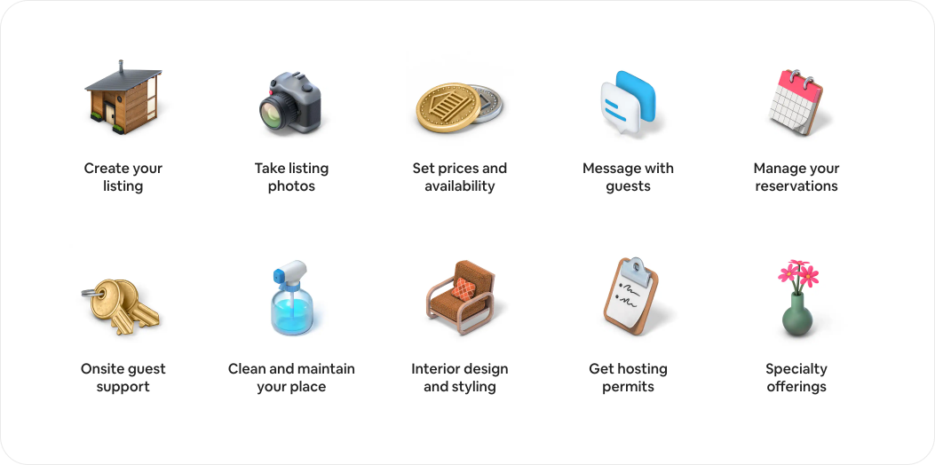
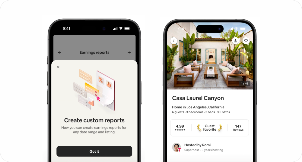
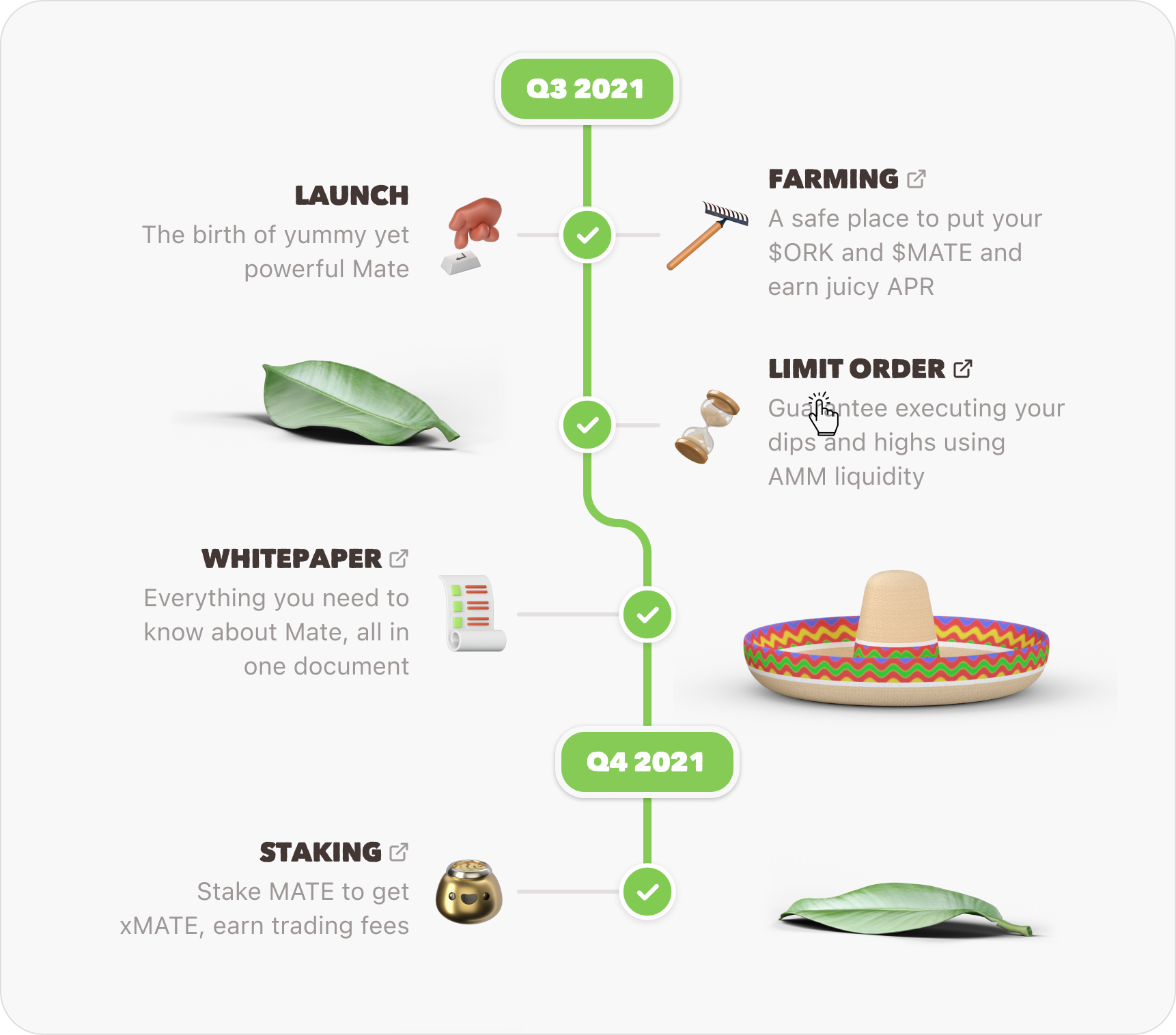
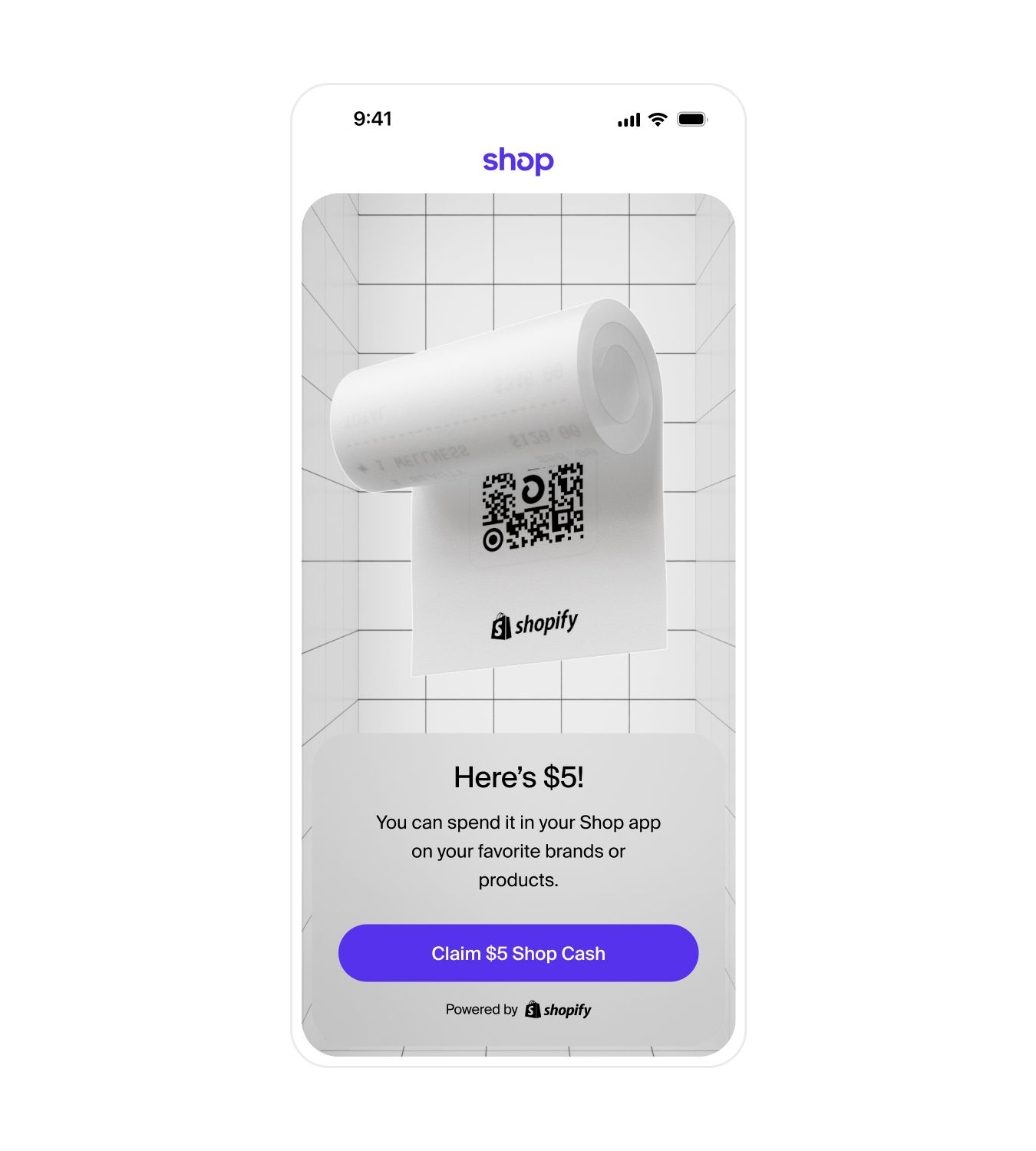
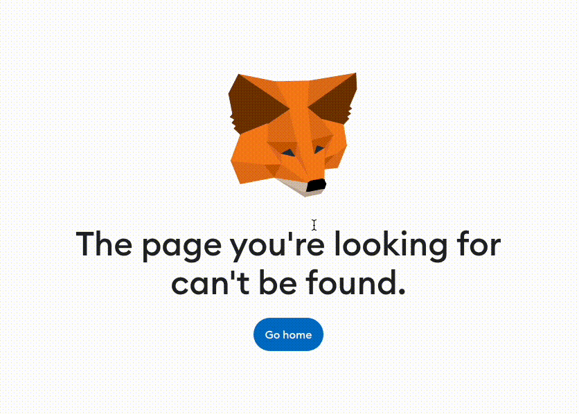
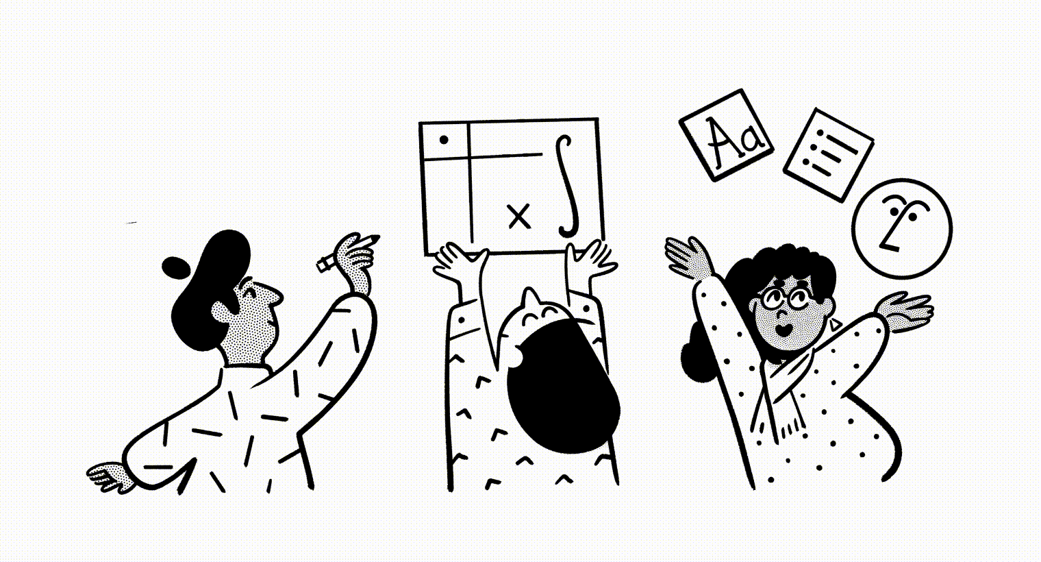
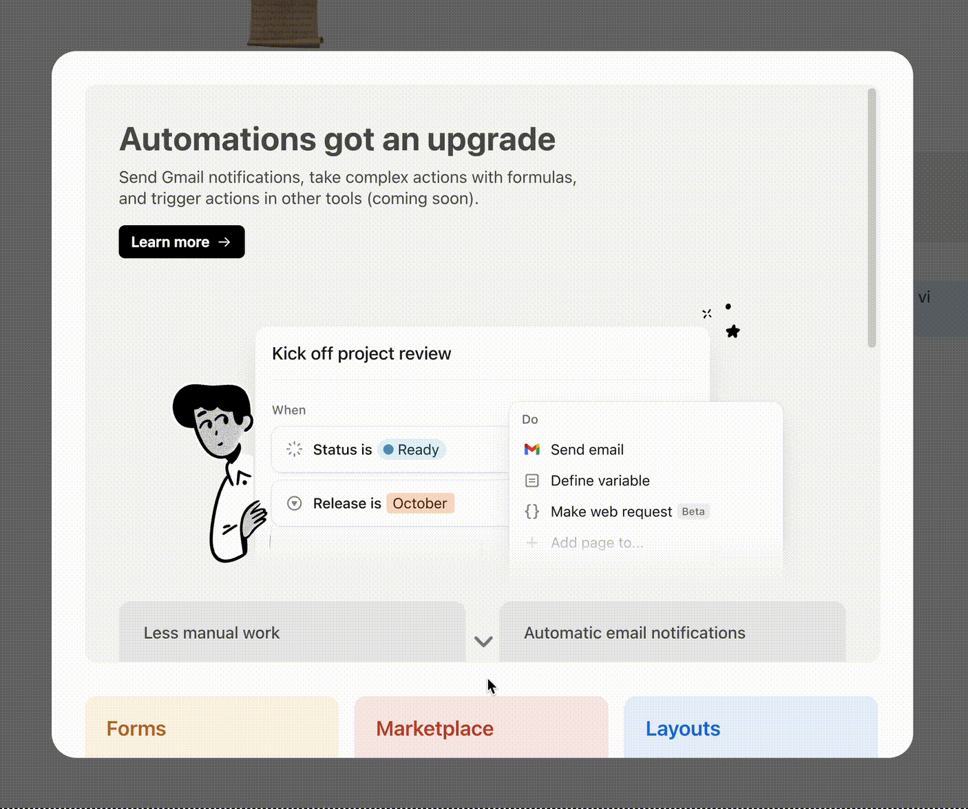
Miscellaneous inspo